
crust club
Designing brand and space for a small business
Conceptual project in designing both the branding and space for a single small business idea provided by a client. With how interconnected the two disciplines are within a hospitality space, this project required cohesion and appeal to target audiences.
THE brief
The business idea proposed was a sandwich café with a thrift store hidden within. Deliverables for this project included the brand identity and the spatial layout with material selections and digital renders.
THE idea
The target audience was identified as 20–30-year-old individuals seeking community in Brisbane. In initial brainstorming, the direction chosen by the client was a concept inspired by the subway systems of New York City. The bustling and vibrant elements convey this sense of high creativity and connecting with others which aligned with the client’s vision.
In the process there was continuous collaboration with the client, alongside testing content and concepts with target demographics and my design peers.
The Outcome: Branding
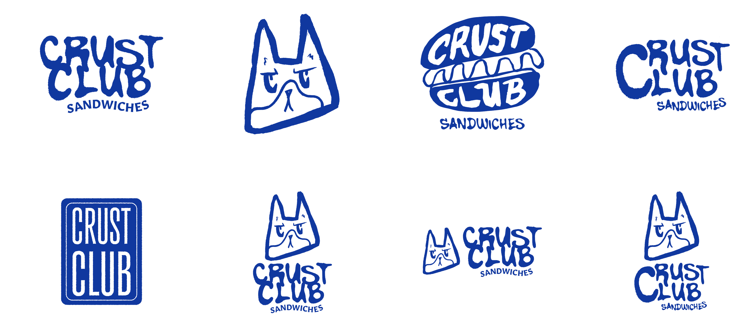
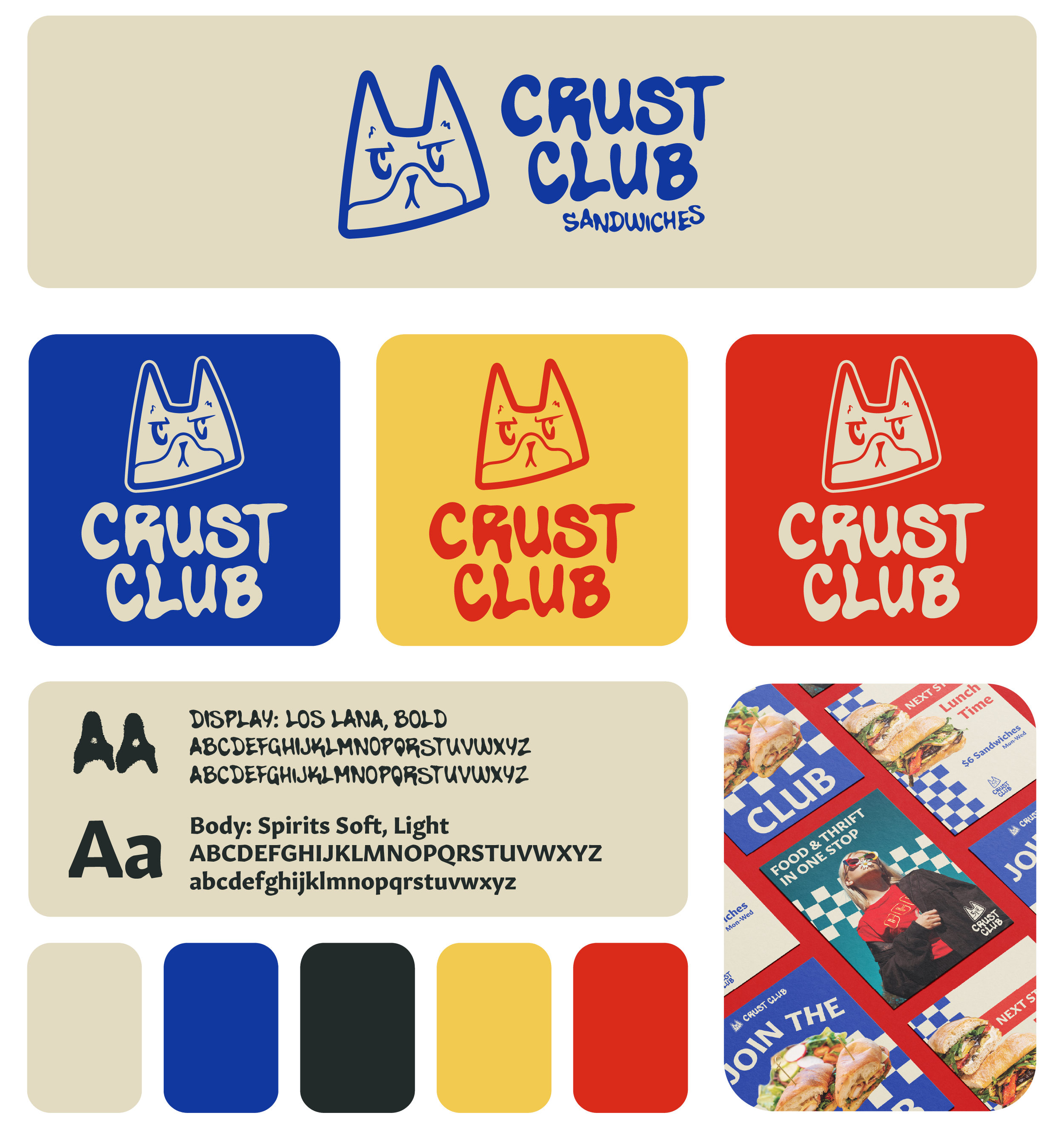
After discussing possible design directions and deciding with the client on an urban aesthetic, the process began with sketching different iterations for the logo. The design needed to feel neutral enough to represent the two different aspects of the business. Being inspired by street graffiti, the client’s cat was chosen to represent the branding in a simple bold style.
The Outcome: Interior
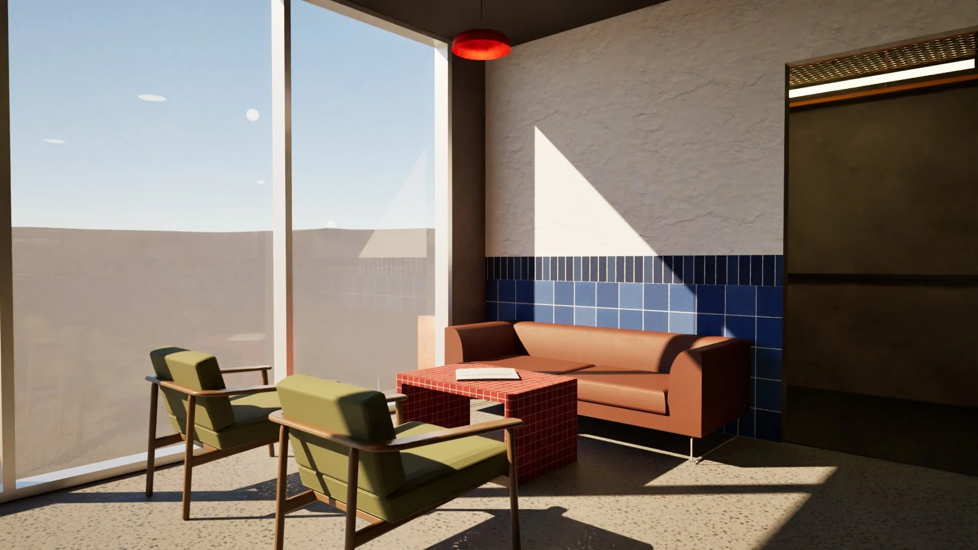
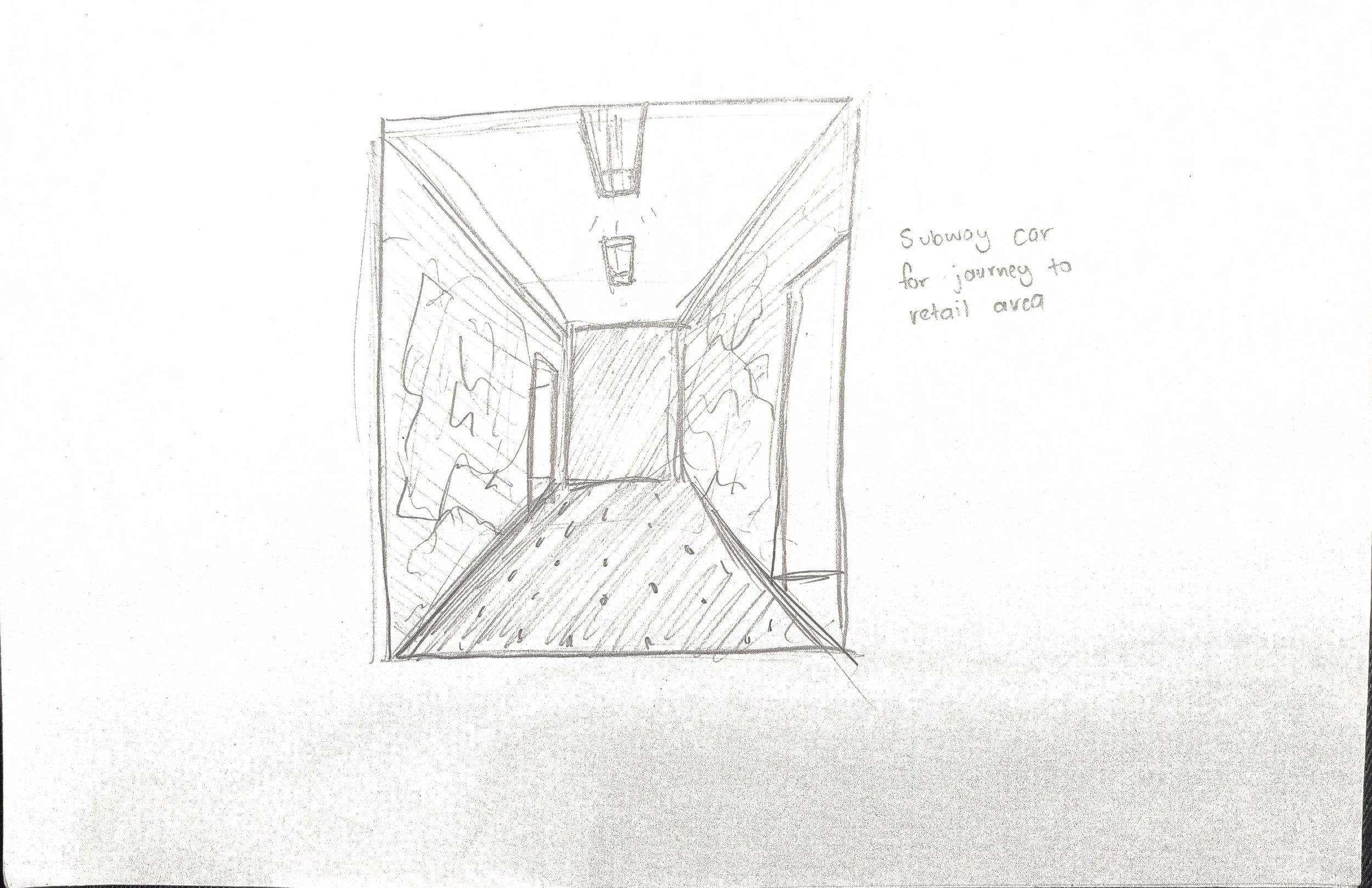
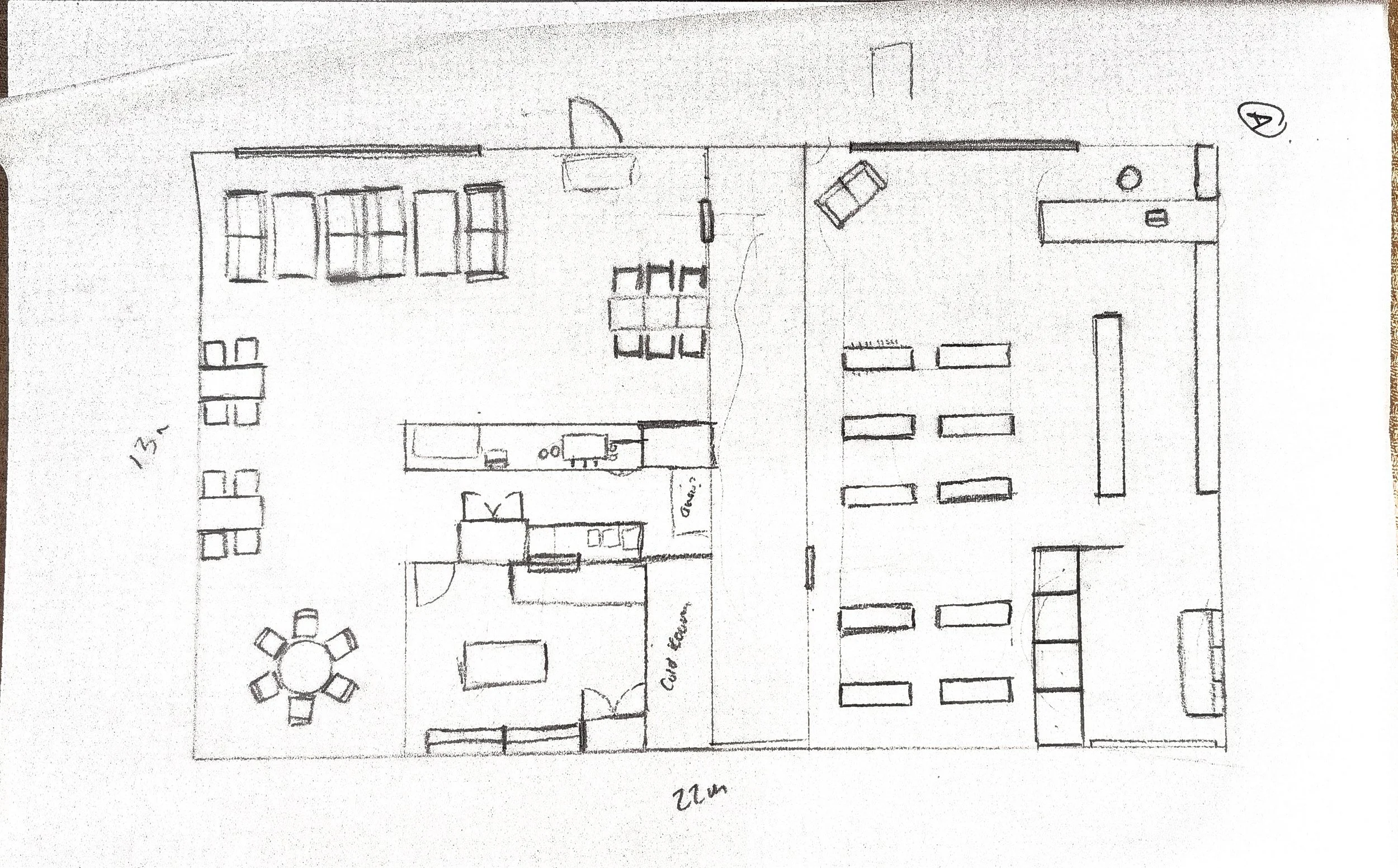
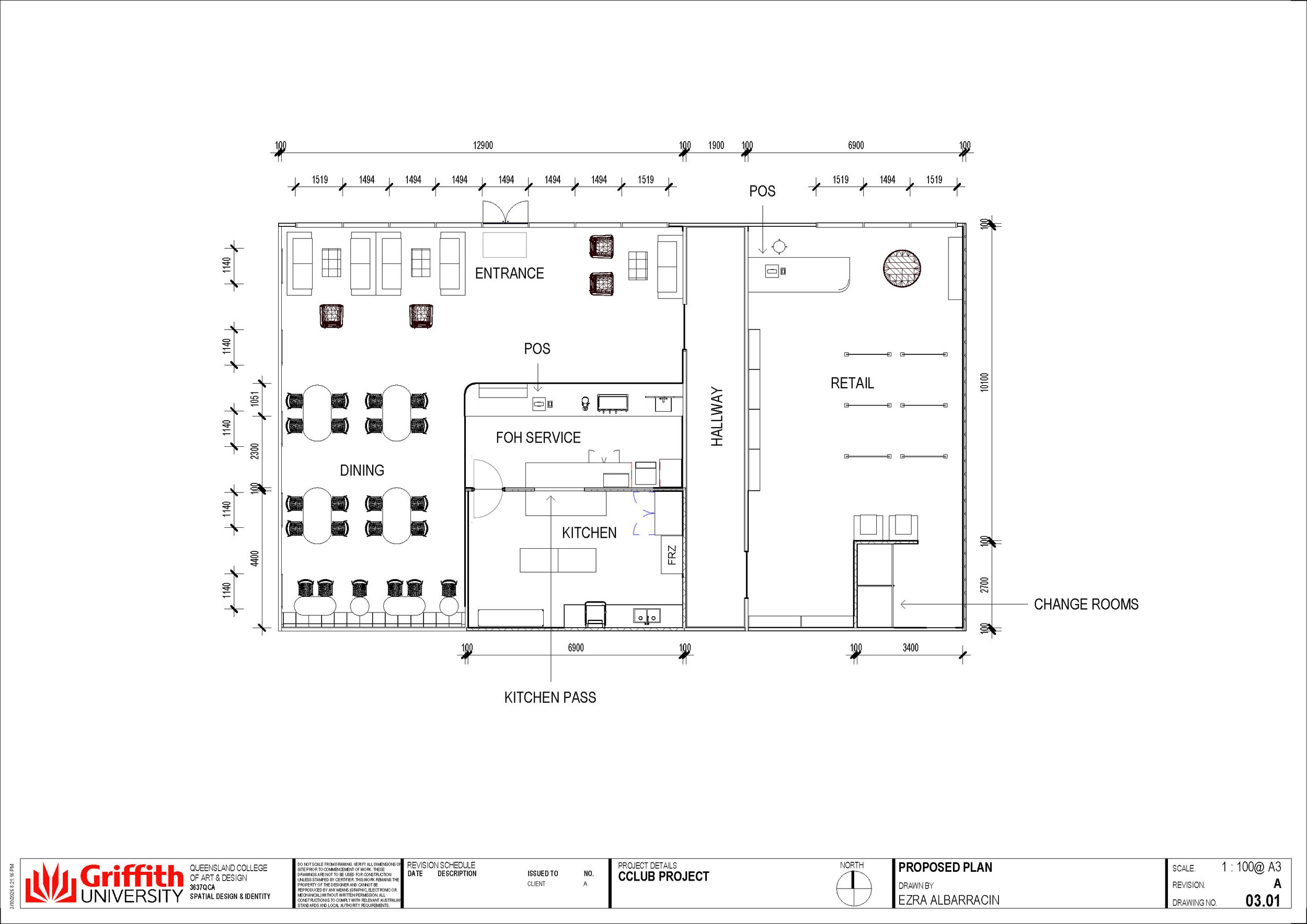
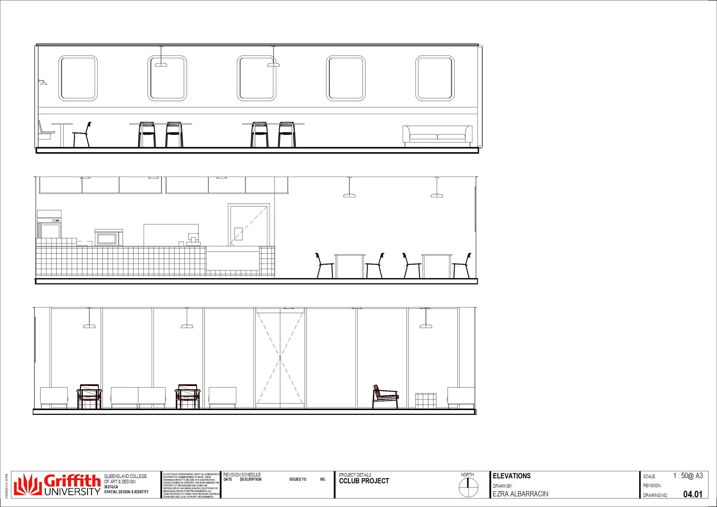
For the interior of the site, spatial planning determined the most effective layout would be dividing the two spaces with a hallway, creating a journey for users to feel they are ‘discovering’ the hidden store themselves. Material finishes consisted of predominately ceramic tiles and metal furniture, in references to train station designs
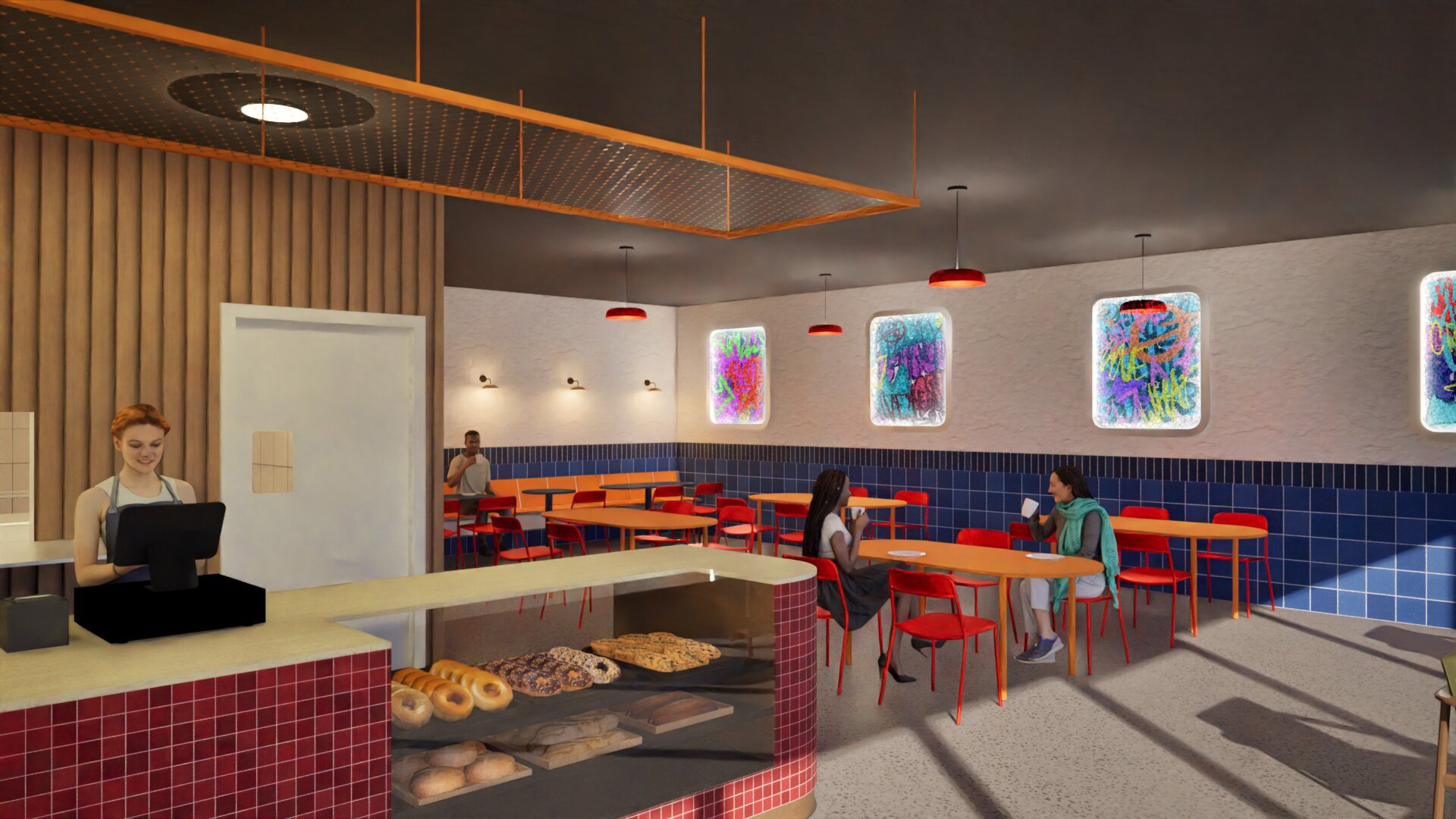
Front counter and dining
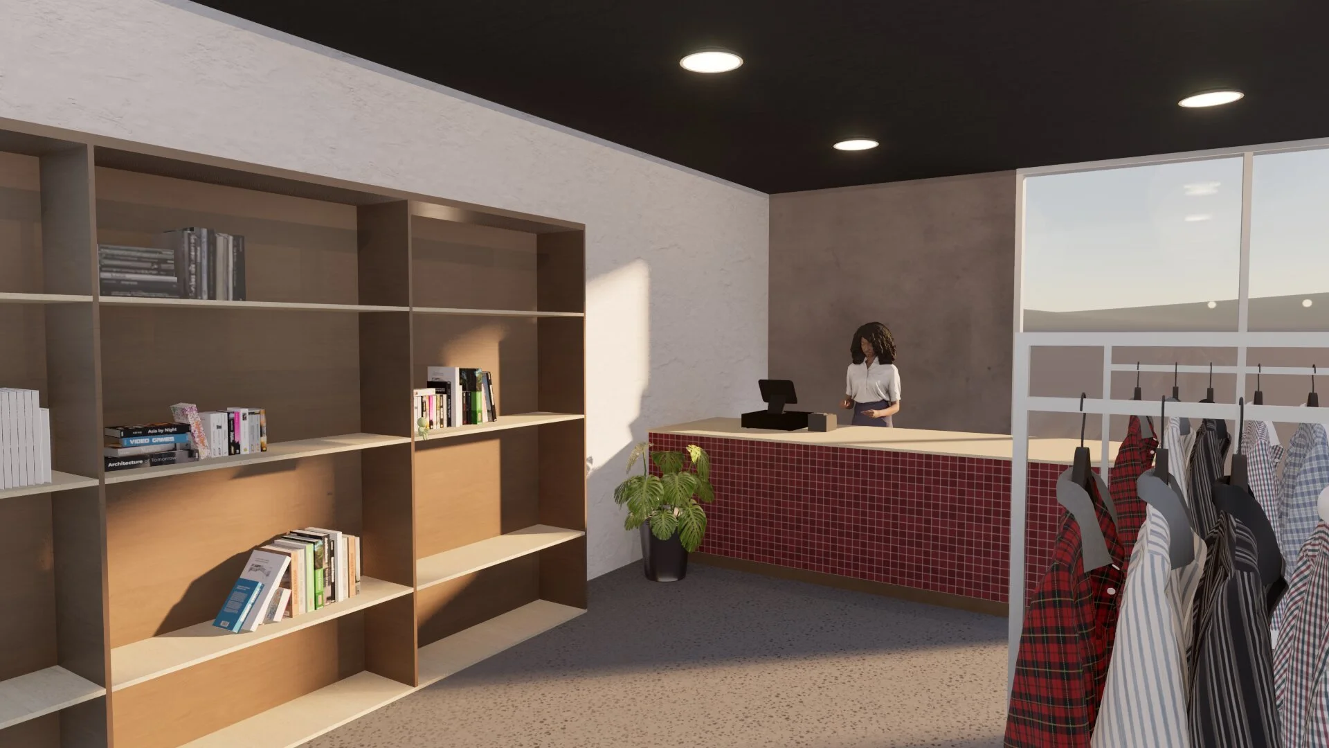
Retail counter
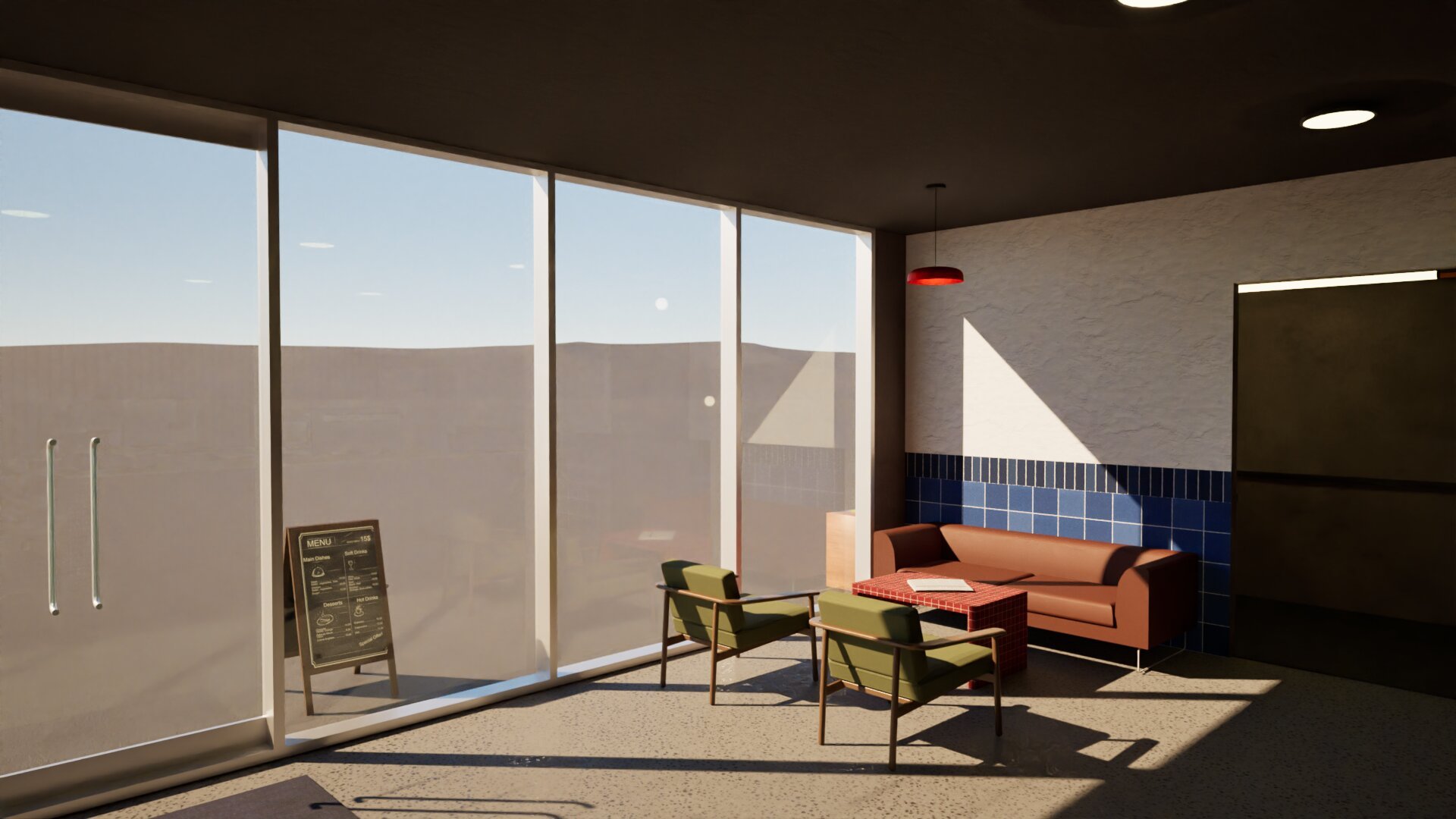
Entrance seating
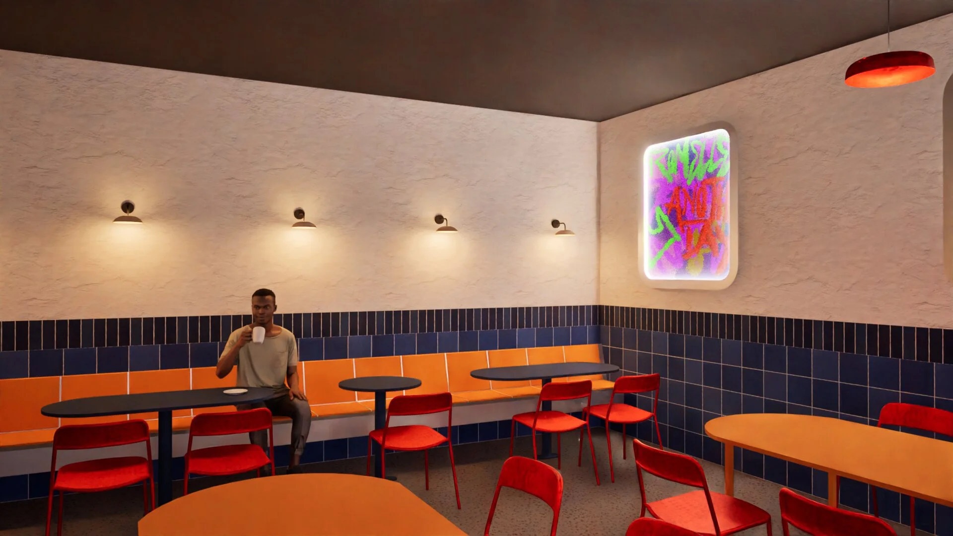
Dining space
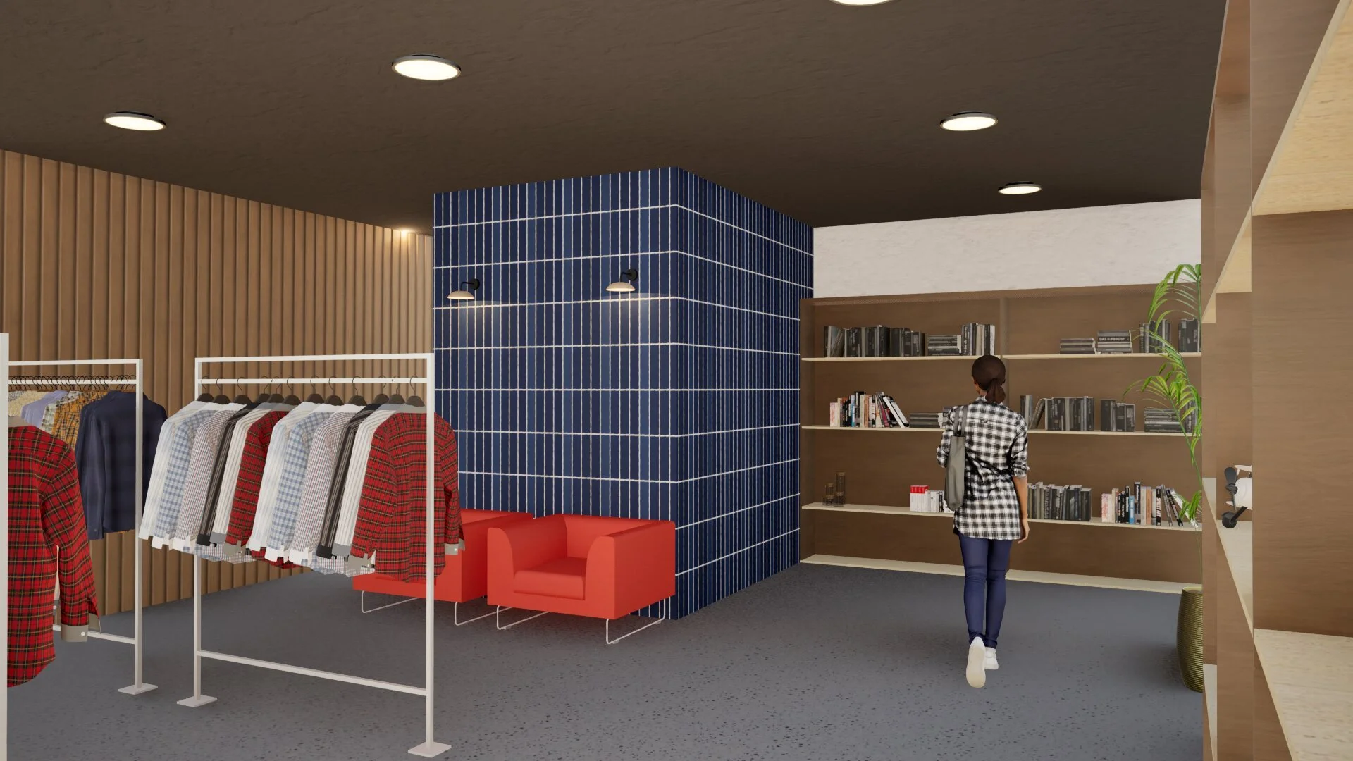
Retail entry
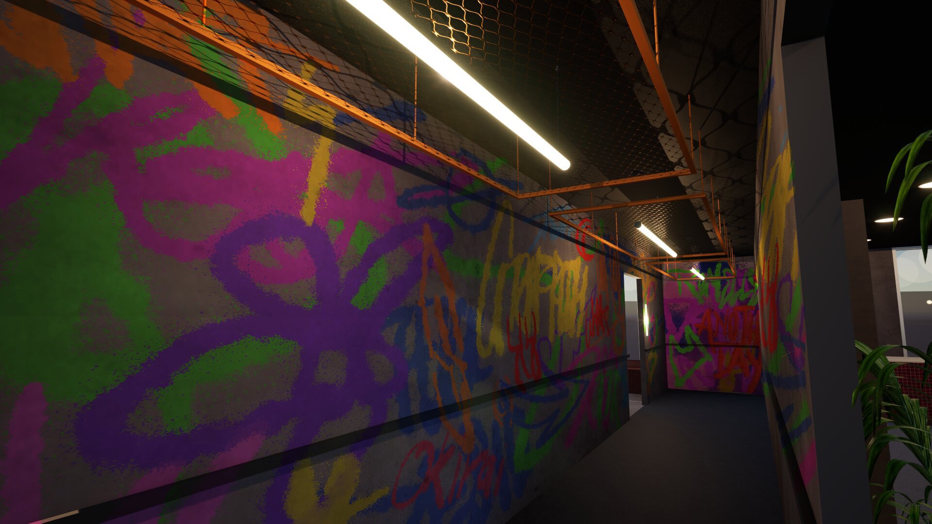
Graffiti hallway
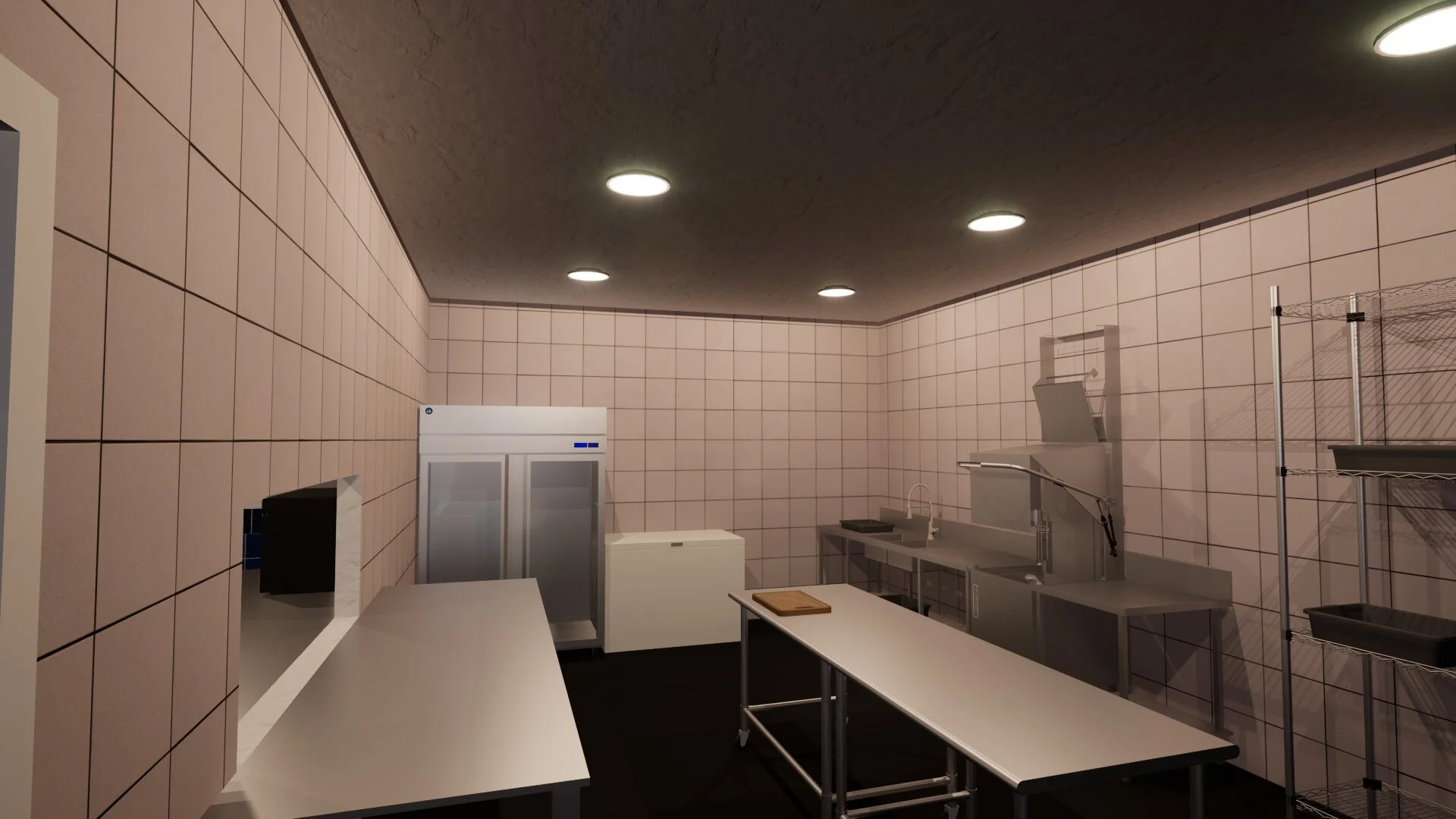
BOH Kitchen
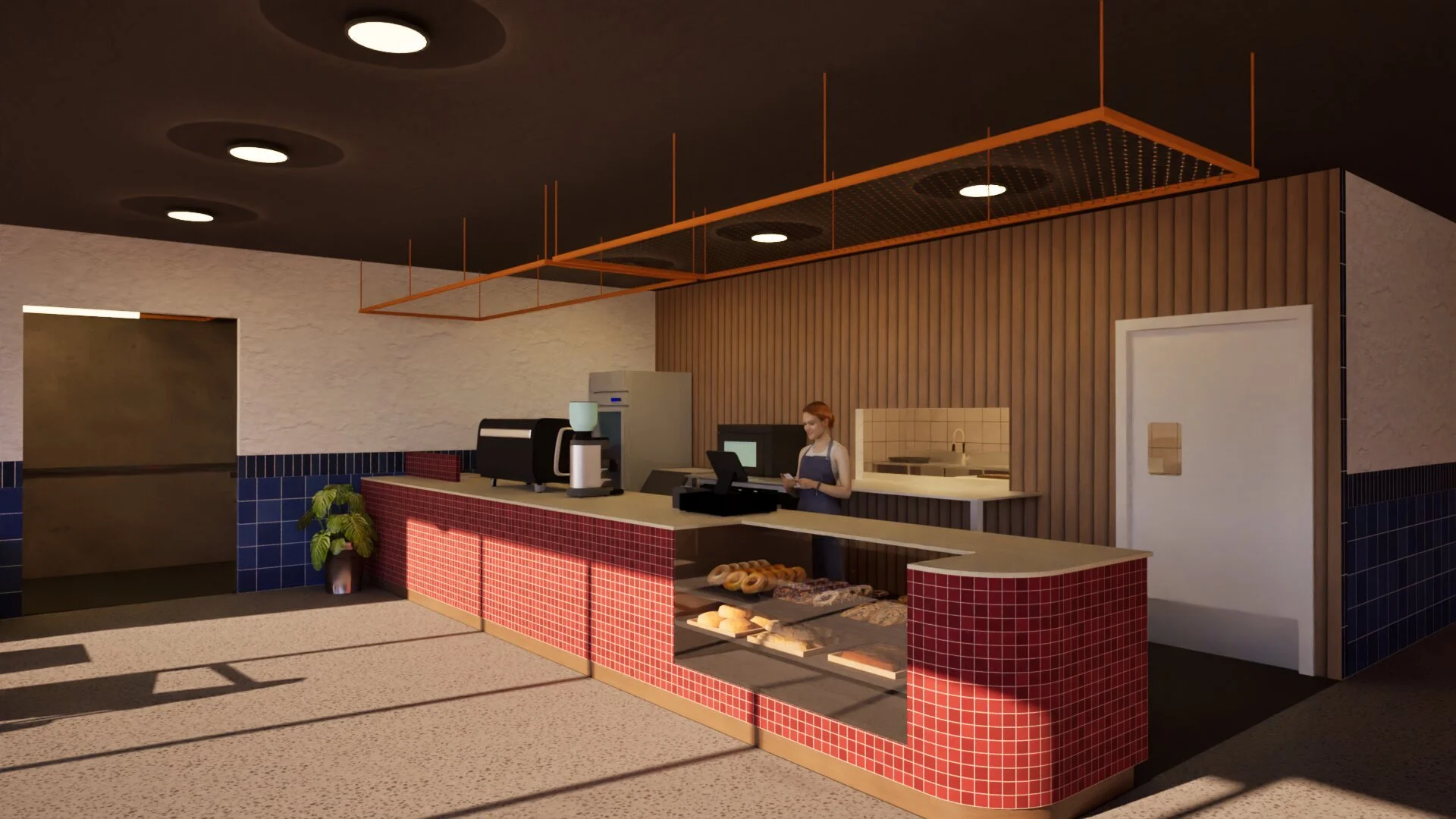
Front counter with hallway entry
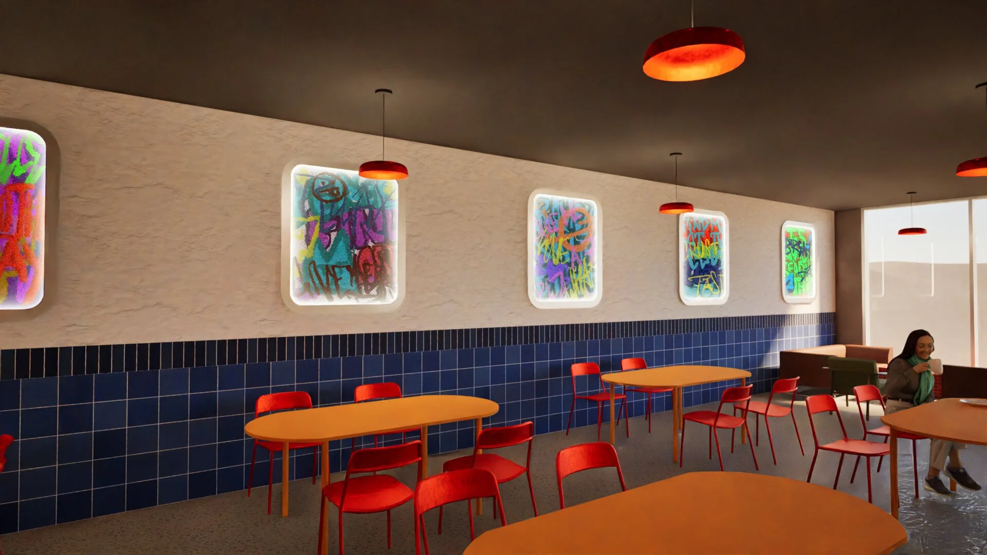
Dining
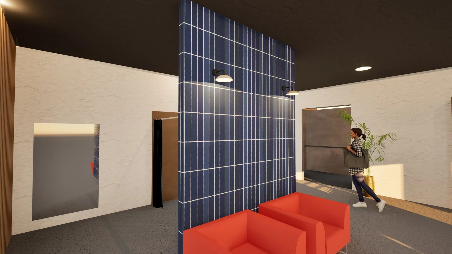
Retail change rooms
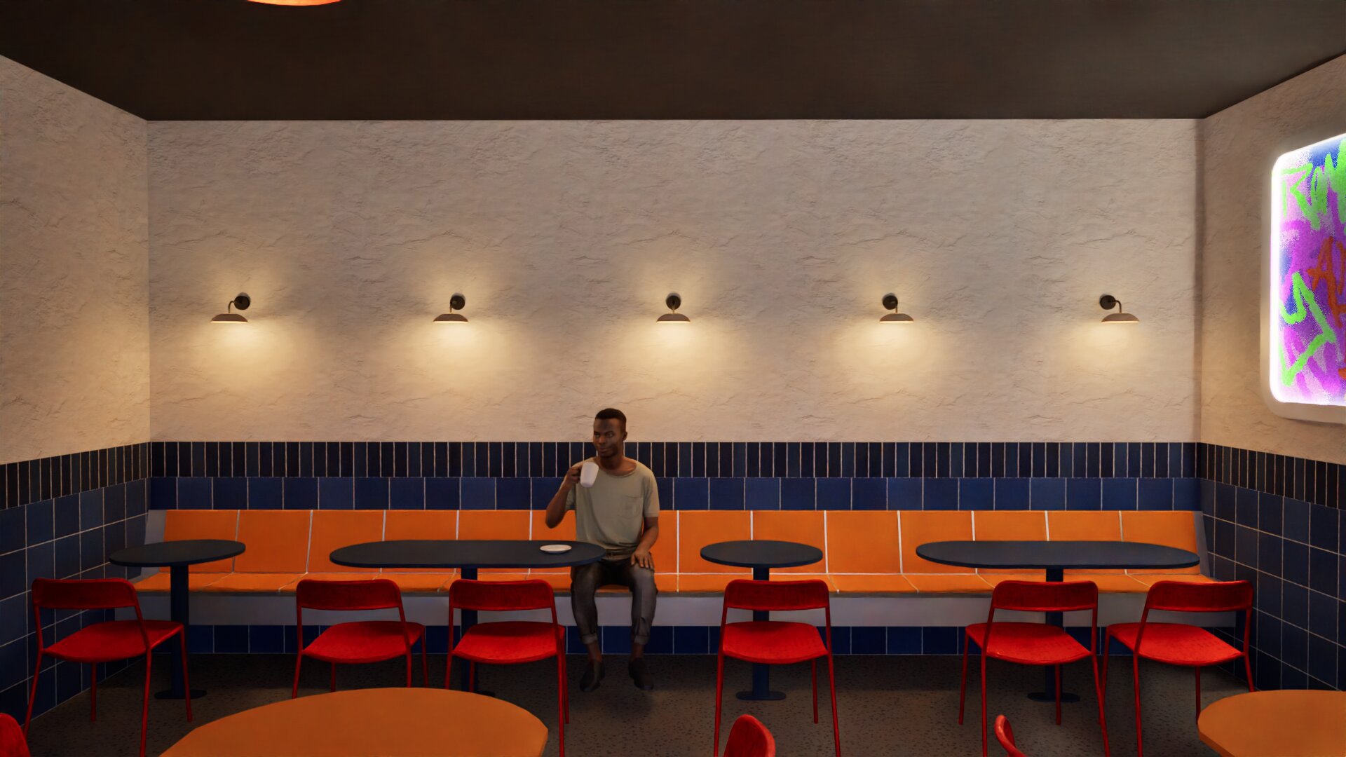
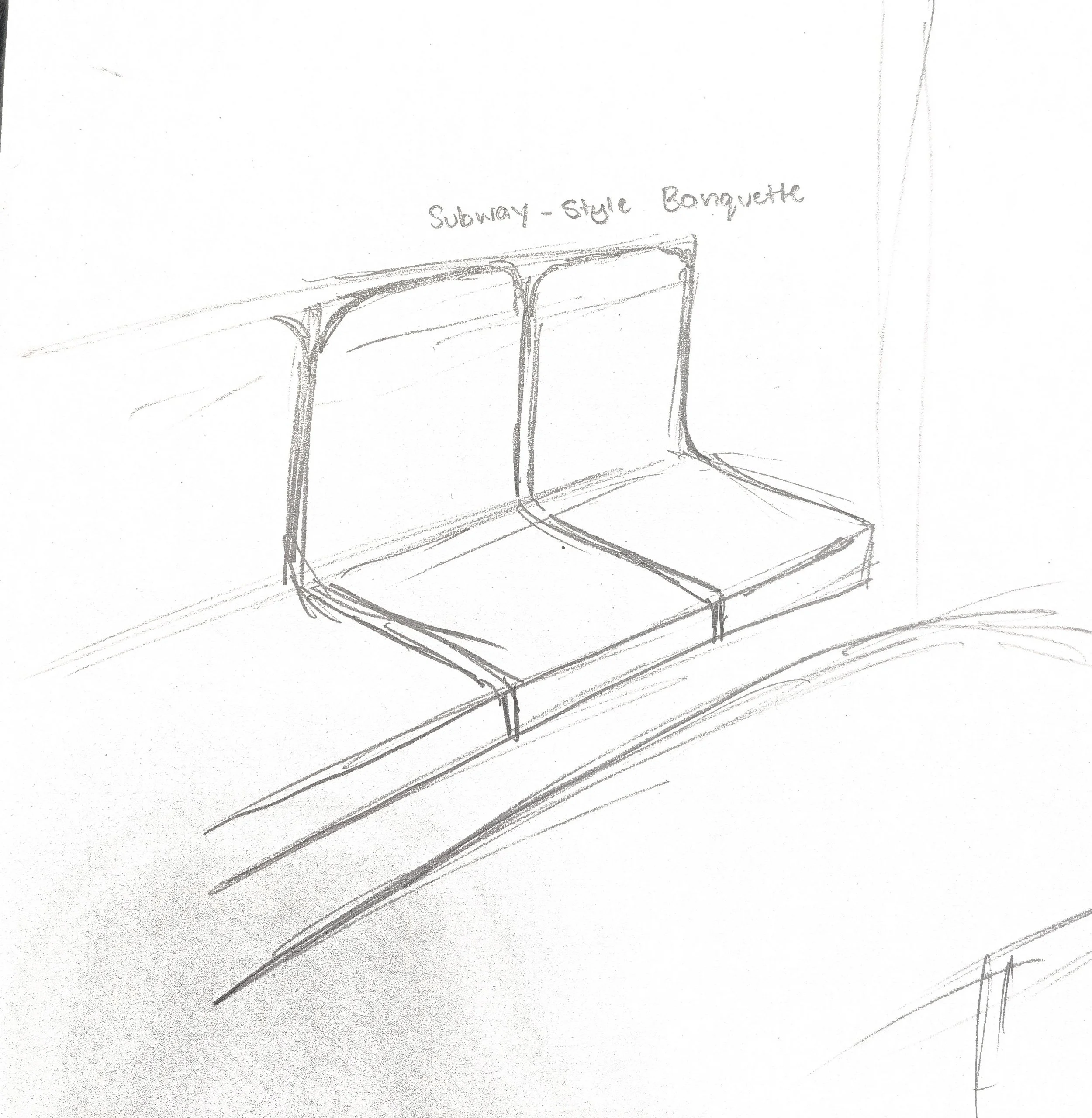
Custom banquette seating
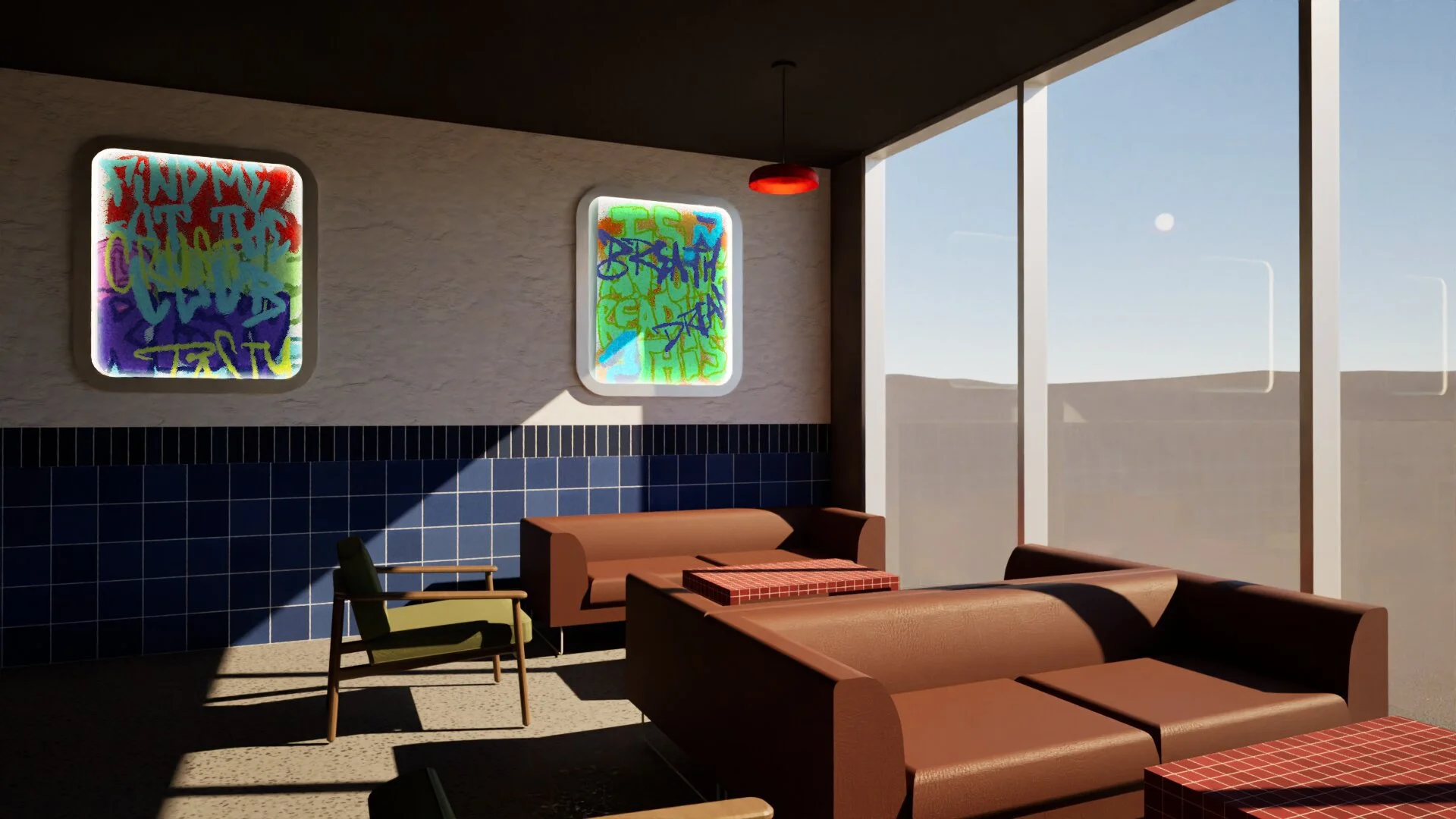
Dining lounge area
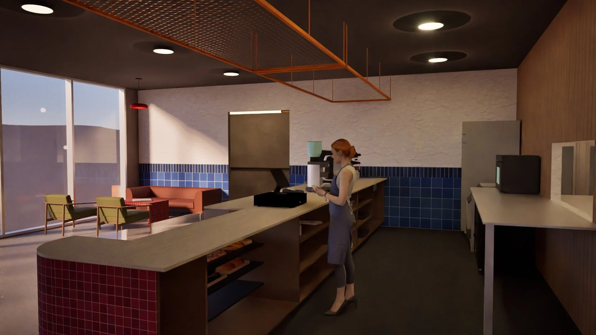
FOH Kitchen
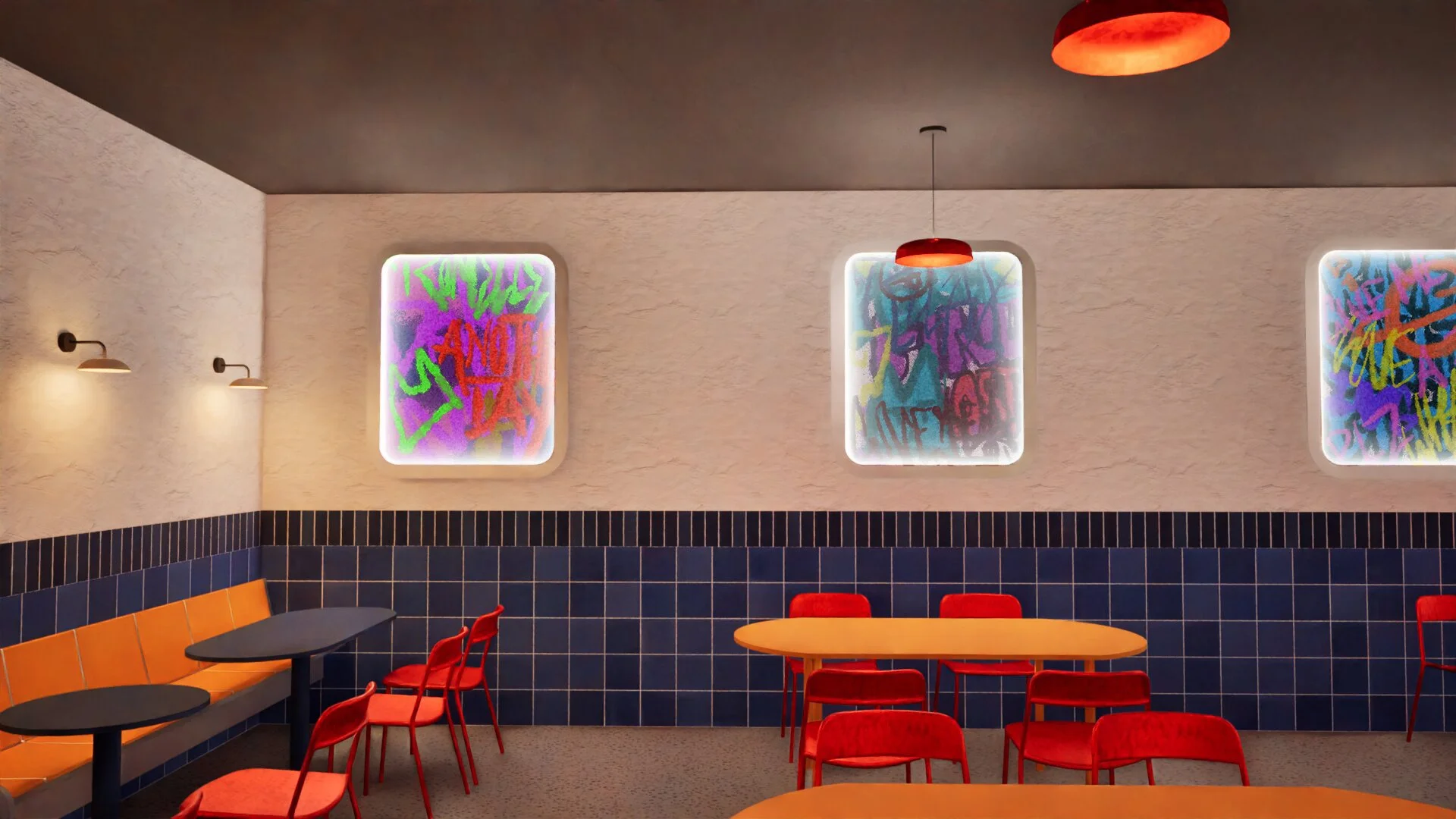
Dining area
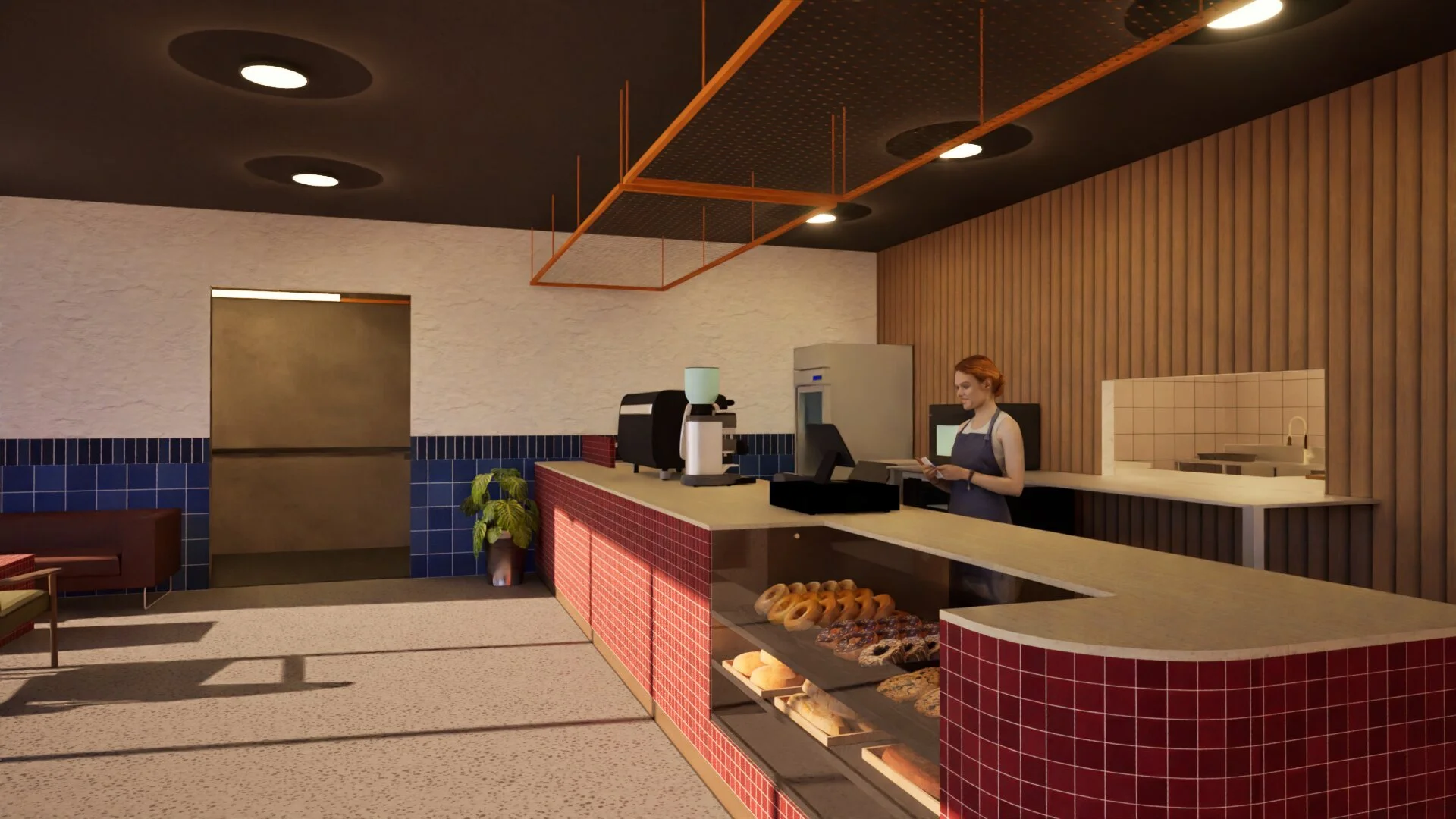
Front counter with hallway entry
Testimonials
"Beginning this project, I had a very vague vision of what I wanted for Crust Club but through development of this project with Ezra, we were able to make what I wanted a reality. His communication of concept made this process seamless, and the results feel unique to me in creating a space for community."
— Client"The brand identity has a clear communication of community culture and the vibrancy of urban spaces. There are clear references to the concept's material while providing something unique for the client. The use of primary colours and geometric shapes create a warm and inviting environment that would respond well to the target audiences. The juxtaposition of the curved features with the rectangular tiles is a highlight component of the overall project, creating a distinct and memorable visual."
— Graphic Design Peer"The interior of this project has utilised engaging colours and textures to create an urban space that stands out. The metallic finishes and raw, warm textures distinctly reference a culture hub that major cities can be. The use of graffiti mural elements encapsulates what creativity different people can bring to urban spaces, reminding me of the street buskers and murals I've seen at train stations even near home."
— Interior Design Peer